NINJAGO: SHATTERSPIN #1

Hi everyone!
In case you hadn't heard Ninjago: Shatterspin #1 was recently announced by Skybound and Image comics. After the Garmadon graphic novel, I received a lot of questions about whether I would be returning to the Ninjago franchise but I had to keep my answers vague until now. It's certainly a relief to finally be able to discuss this project (somewhat) openly after working on it for the better of last year!
Shatterspin once again focuses on a young Garmadon during a key point in his life as encounters a mysterious new threat and takes on some new responsibilities that will change him forever. The series will tie much closer to ongoing LEGO continuity and I'm once again on writing and drawing duties. However due to the amount of work, I will only pencilling the comic but the inker and colourist we have lined up will really knock your socks off (can't wait to share the finished pages).
In the meantime I thought I'd share with you a bit of process for the cover of issue one.
Thumbnails and Roughs
The idea for the cover was to showcase a young Garmadon in a mysterious Wolf Temple facing off against some mysterious danger. The story has a lot of adventure in it and Garmadon does a lot of travelling to different places so originally I thought it be cool to have him garbed in a cloak and adventure gear. But since he's in his younger human form, there was always the worry that it would not be clear that this was a young Garmadon instead of his more familiar Oni self. Eventually I decided to err on the side of clarity and keep him in his traditional costume for this first issue.
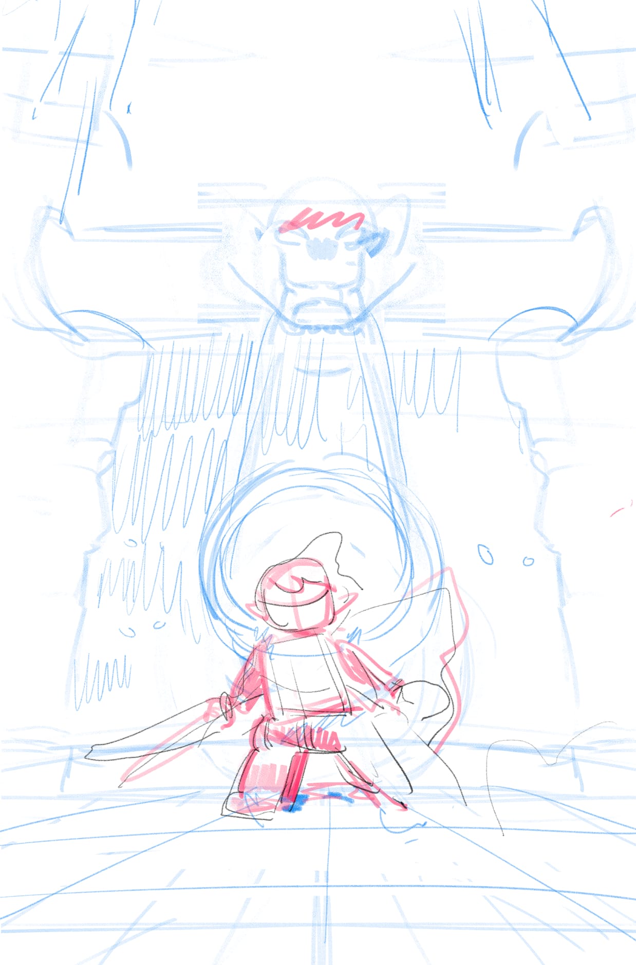
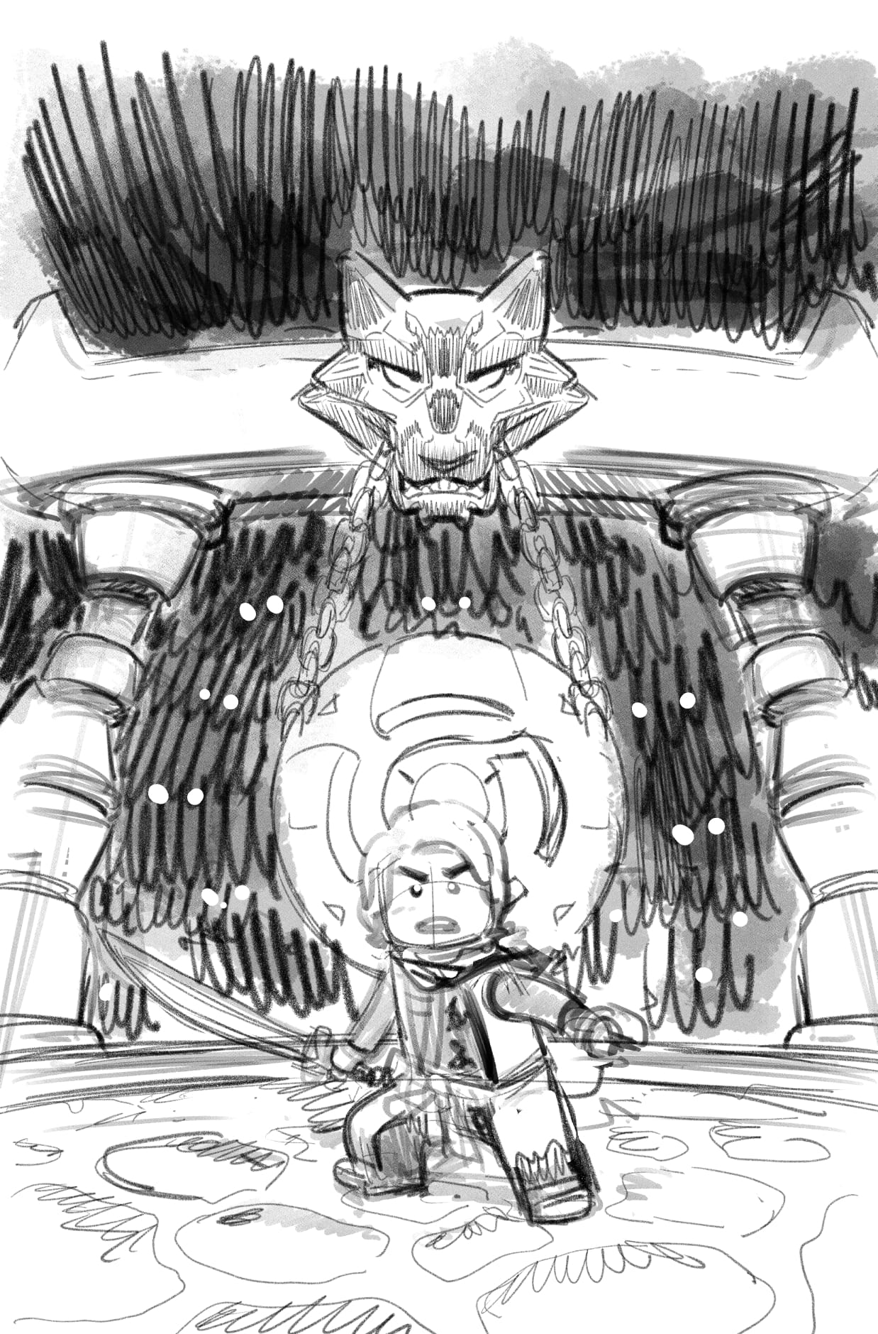
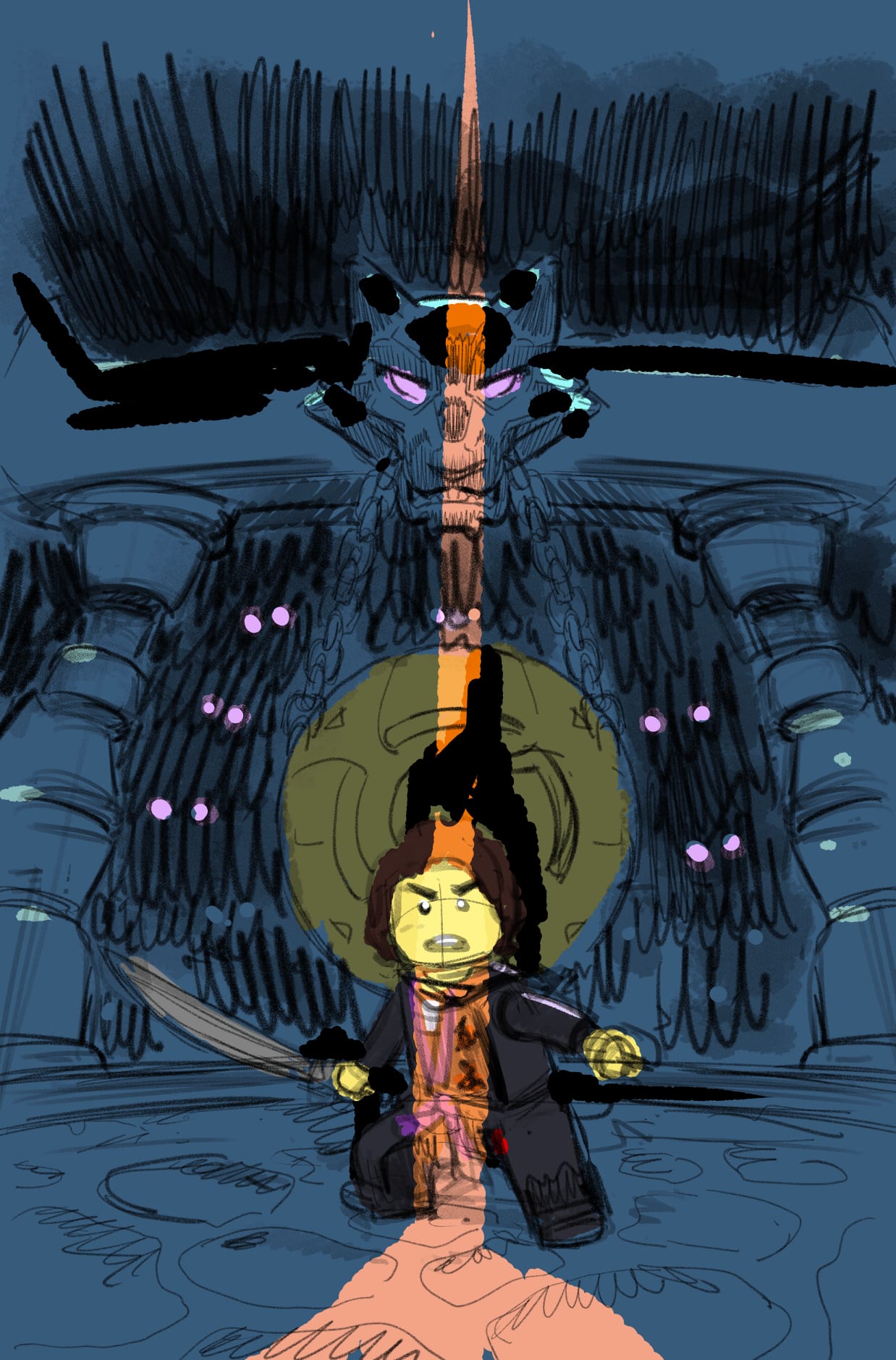
Inks and Color
I have a habit of doing inks and color at the same time. There's pros and cons to this approach, it allows me to better gauge the progress of the image but it can become a little chaotic as I bounce back and forth. In this case, I started to feel like the idea of a doorway opening off camera wasn't quite working. It's a cool idea but it also flooded the image with a bit of warmth and I wanted to keep things ominous and mysterious. I eventually decided to scrap that idea completely.
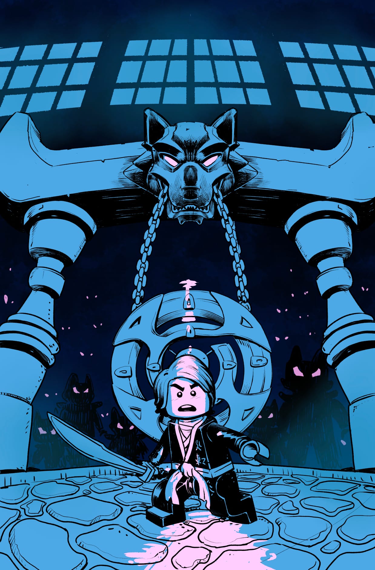
As the image was nearing completion, we decided that Garmadon could do with a bit of a more determined and courageous expression. We also changed up the floor to better match some details in the show as well as rescale and move certain elements.
Protip: When working on licensed properties, keep things on different layers. It's more work up front but it will make your life way easier when it comes to revisions. I did not follow my own tip on this cover....
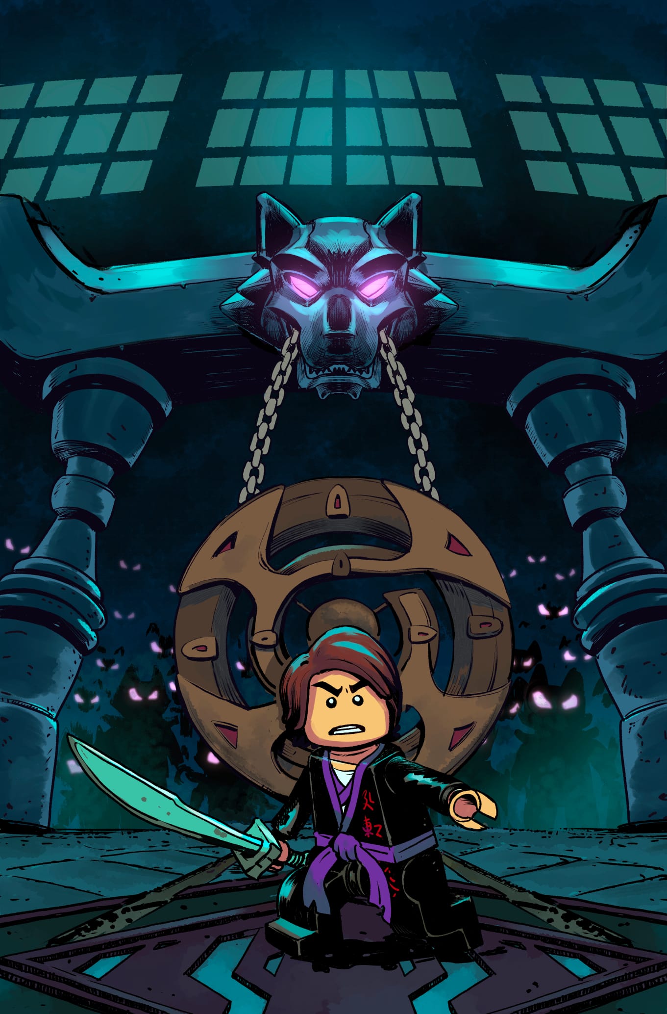
And there you have it. The final cover!
Hope you enjoyed this behind the scenes look on my cover illustration process. To tell you the truth, covers are the thing that I find most difficult to do when it comes to making comics. Partly it's because I don't get the opportunity to do too much of them (there's only cover per comic after all), and partly it's because of the importance this single image has in selling the story. But I have a ton of fun doing them and it's always gratifying when I finally manage to wrangle one into decent shape by the end.
Have a great week everyone!
Tri

